New year, new Coffee Break!
From how to build a new personal brand, to how a new name could add to your brand story, it’s all things new in our first Coffee Break of 2017.
Candice, Managing Director
Kick off the new year with embracing your personal brand
It’s the start of a new year, where individuals make (personal and business) New Year’s resolutions or goals for 2017. Whether that is to be a healthier person this year, get that perfect job, get promoted, build better contacts and clients for your company, do more to help your clients see the value in what you do, the list goes on, but do you realise how important it is to build a recognisable personal brand?
The term “branding” has always been associated with companies, but every individual has a personal brand. Not many of us have consciously cultivated these brands, but they exist nonetheless. The personal-branding concept suggests that success comes from self-packaging. What do people associate with you when they think of your name? Are you perceived as an expert in your field, or are there general qualities that they link to your personal brand?

Here are three tips to start the new year, which might seem simple and obvious, but we all know how quickly we can all get distracted once the targets are set, the crazy deadlines kick in and weeks seems to fly by!
What’s in a headshot?
Have you ever Googled yourself? Whether you appear on a company website, in the press, on various social media platforms that you have joined, it’s important to reflect the right image of yourself. You might use the same photograph, year after year, but now is the time to revisit and refresh that photograph. Having a professional and up to date photograph is essential and a powerful tool to communicate and connect with career-minded individuals.
Build a better online presence
This year aim to build and nurture your online brand by providing a richer visual experience. We’re seeing a rapid replacement of the alphabet’s 26 letters, which are being pushed out by pictures, both still and moving. Take the opportunity to show the world who you really are, integrating some personal activities with your professional ones, and remember authenticity is key in the digital world we live in.
Increase engagement with your target audience
Build your personal brand by showcasing your knowledge and expertise in your industry, speaking in a manner that will make you stand out in a crowd. Don’t forget how important it is to acknowledge and engage with your audience on a regular basis. Make sure you interact with others and share their content.
Building a recognisable personal brand opens professional opportunities. You might work for a business that works with other businesses, but it’s people working with people and that make business relationships valuable. Hopefully these have helped to kick start your new year and create a successful and impactful personal brand for some of you!
Sian, Creative Strategist
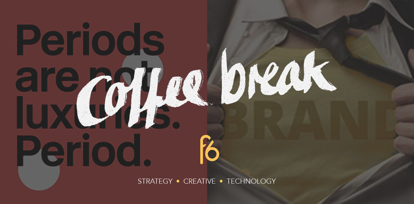
Why renaming your brand, and then renaming it again, could create a more powerful brand story
It’s an issue that affects over half the population of the US (and currently the UK), but has only started to gather attention in the last few years. According to Pentagram, women in the US are spending up to $70 a year on menstrual products, with many low income women struggling to cover the costs. Food, toilet paper, medicines and birth control are all untaxed as they fall in the category of being essential items for living, whilst tampons and pads continue to have a hefty fine slapped on them.
It’s 2017 and coping with a uncontrollable monthly biological event isn’t regarded as essential – but don’t worry – you can eat those essential Jaffa Cakes, tax free!
“If men got periods, tampons would be raining down from the skies.” – change.org petition supporter
Step forward, Period Equity, a non-profit organisation dedicated to repealing sales tax on menstrual products in the US.
Originally named Menstrual Equality, the branding has focused on naming as a key feature to be utilised by the identity. Not only does Period Equity sound stronger (and according to the creators, is slightly less off putting), but the group plans to change the name of the organisation to Equity, Period, when the group meets its goal. For many changing the name of their company is something to avoid like the plague, but here the bravery pays off to add an element of accomplishment and finality to the brand story – it just makes sense.
The designers have also shown similar bravery in the development of a visual language that ‘pulls no punches’. The strong logotype uses Margaret Calvert’s sans serif New Rail Alphabet typeface in a stark black that imitates a no-nonsense and bold approach to the brand, finished with red spots to reflect the name and nature of the cause.

And being visually blunt regarding a subject some still find uncomfortable is an important reflection of the organisations aims – to undo stigma, and in turn give greater visibility to issue.
It’s hoped the brand identity will help advance menstrual product access, affordability, and safety through getting the attention of law and policy makers. You can sign the petition supported by Period equity and Cosmopolitan here.