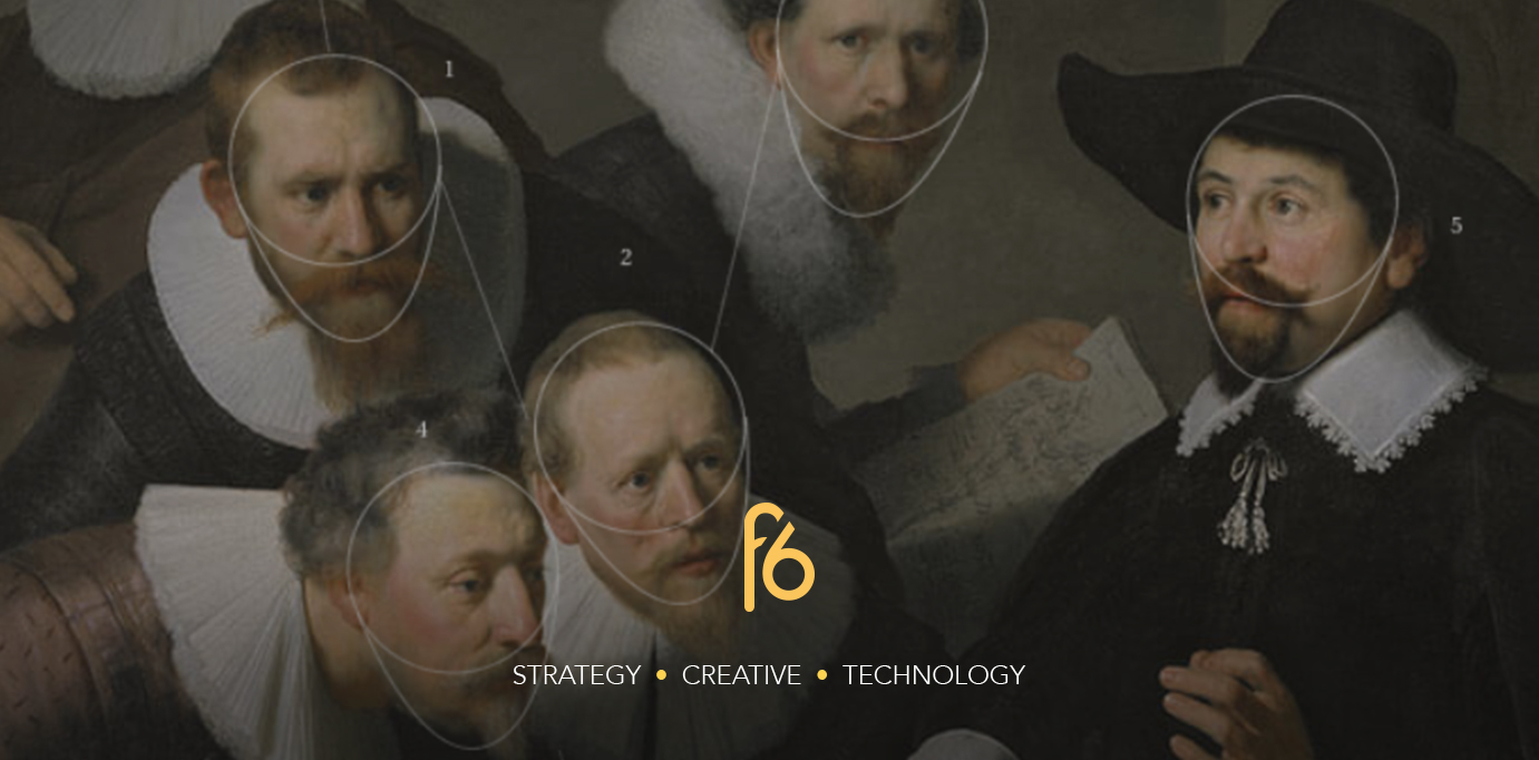
What does it take to forge a Rembrandt? How about a Coke advert? The first is difficult but not impossible. The second is easier, and is designed specifically to be so. Both share a similarity in that they apply distinct visual systems that can be replicated again and again, depending on whether you know how to do it.
All fine art forgeries are imitations of a visual style. A Rembrandt expert knows the traits that Rembrandt employed in his paintings, and can look for these visual cues to attribute work to him. Knowingly or unknowingly, Rembrandt created his own pattern of visual language, through a sustained use of colour pallete, technique, and subject. Today, even a computer can analyse these characteristics and 3D print an entirely new painting using Rembrandts visual patterns to pull off a perfect forgery. You can see that project here.
“(He utilized) a limited color palette for facial emphasis, (and) the data lead us to a conclusive subject: a portrait of a Caucasian male with facial hair, between the ages of thirty and forty, wearing black clothes with a white collar and a hat, facing to the right.” – The Next Rembrandt
When it comes to branding, design is all about systems and patterns. These patterns are used to create a distinct visual language that can be attributed to a company.
In the same way we understand verbal cues, we can also understand visual cues. Some are universal, some are culturally dependant, but the overall aim of a visual language is to communicate an idea that can be seen and understood, rather than heard.
Visual languages and brands
A visual language for a brand will consist of the visual (logo, iconography, colour, typography, photography, motion), sensorial (texture, illumination), and interactive (digital behaviour) opportunities and touchpoints. Working out this language can take months, but can be destroyed in moments if not applied properly; a language mistranslated is easy to misunderstand.
See a painting of a bright pink banana and you’re unlikely to believe it’s an authentic Rembrandt, and more likely to think it’s a Warhol. Receive a business card from a Lawyer typeset in Comic Sans, and you’re unlikely to let them defend you in court. See a Coke advert where the white bottle (even the shape of said bottle is part of the visual language) is set against a dark blue background and you might think it’s for Pepsi. All of these things make us uncomfortable because they’re using a visual language we don’t associate with the attributed owner.
If executed properly however, a visual language will do all the things a great brand does: communicate the values and big ideas of a company, differentiate a company from its competitors, encourage association and belonging, and finally migrate and grow with the company.
The importance of visual languages for audiences and designers
A consistent, conceptually grounded, well thought out visual language will help two groups of people – the audience, and the designers.
For the audience, visual languages create better experiences through more cohesive implementation from the designers. Indeed, brands are more easily recognised through a more consistent communication of ideas, and an audience should be able to connect the dots across touchpoints from digital to print and beyond, creating a unified brand experience.
Style guides or brand guidelines are usually used to control the use of the visual language, giving designers constraints to work within, whilst keeping everything consistent. In reality everything a brand pushes out will have passed through the hands of different designers, across different platforms, and brand guidelines help to keep it looking like only one person has produced everything. As well as this, it ensures the ideas behind the company are never lost.
Constraints also produce better results by limiting the amount of potential outcomes and avoiding disjointed solutions. The best designers will also work divergently to push the boundaries and come up with exciting ideas that take the brand and its visual language to the next level, whilst retaining those key visual cues.
So what does it take to forge a Rembrandt or a Coke advert? A knowledge of visual languages is a good start.


