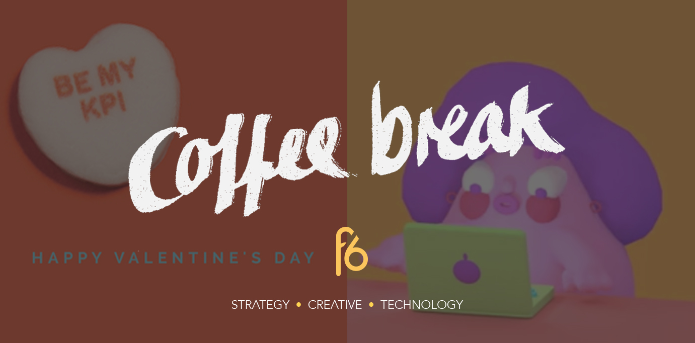
Be our Valentine? Join us for a coffee date where we discuss what makes a great Valentine’s campaign and why it isn’t just about targeting couples. Elsewhere, we’re looking at why people not reading important documents is a design problem that can be solved with GIFs.
Candice, Managing Director
February, the month of love in advertising…
Whether you are a hopeless romantic or a complete pessimist, this week’s coffee break is inspired by Valentine’s Day. Valentine’s Day became commercialised during the middle of the 18th century in England, with lovers sending each other sweets and cards with flowers. Now about a billion Valentine’s Day cards are exchanged every year and it’s the second largest seasonal card sending time of the year.
Annual consumer spending on Valentine’s Day totals 13.2 billion on average, according to the Retail Advertising and Marketing Association. It’s usually a day where companies spend a huge amount of money geared towards couples, but with around 40 – 50% of UK adults identifying as single today, that may not be the best practice anymore. Many people are focused on buying gifts and experiences for friends, co-workers, clients and pets rather than someone special. Yes I said pets.. It’s time to switch gears and start focusing your Valentine’s Day efforts to include everyone.
Looking back at last year’s Valentine’s day campaigns, I distinctly remember the campaign by Evens Hunt: Agency Valentines. If you missed it, it was a clever personalised campaign dedicated to their clients, whereby they sent custom made sweethearts candies with an advertising theme of love notes written on them. For example: “Twist my headlines” and “Be my KPI”. You can view the campaign in detail here.
This is a great example that campaigns don’t need to be boring. You can refer back to one of my previous coffee breaks, where I go into detail about using your customer data for personalisation to help drive creative campaigns here.
A data-driven focus does not mean that creativity is pushed aside. Businesses can adopt an approach that strikes a balance between data-driven insight, creativity and intuition.
Here are some interesting stats from Bing to learn how Valentine’s Day has changed over the years to help guide you when running campaigns next year.
Remember, it’s important to focus on nurturing your existing client relationships as well as driving campaigns for new business. Focus on the your data to maximise how you are targeting them to maximise your marketing budgets. I’m looking forward to seeing which campaigns rank to the top and think outside of the heart-shaped chocolate box for this years Valentine’s day!
Sian, Creative Strategist
If it’s important, use a GIF
We all know the drill when it comes to terms and conditions–scroll as fast as you can to the bottom and tick the agree checkbox. It’s very rare to find someone who reads these type of important documents. Most of the time they’re so mind numbingly boring and difficult to understand that we’ll ignore them whenever possible, and treat them as an inconvenient obstacle that can be obliterated with a simple lie, especially when no one’s looking– “sure, I read them, now give me my download”.
Documents like codes of conduct are important in establishing expectations, behaviour, purpose, and values across a business, from employees to board members. They establish accountability on all sides, which is why they’re so important to read and understand. But, like the terms and conditions Apple makes you agree to, these codes are lengthy and filled with corporate jargon, meaning we can theorize that if a lot of people don’t read terms and conditions, they sure don’t read codes of conduct, let alone make an active attempt to understand them. Labelling a document as important in capital letters isn’t enough anymore. For businesses, this presents a design challenge: How can we use design to encourage people to read them AND understand them?
Telia has answered that question with it’s new site Don’t do this at work.
Telia hasn’t had a great track record when it comes to corporate compliance and ethical business practice (think corruption and aiding government censorship). It was therefore important that these issues were addressed from the inside, creating a clear sense of responsibility and accountability. So how do you get people to engage with something perceived as a boring waste of time?
The site’s main way of communicating is through brightly coloured and scenario related GIFs. Using GIFs at work is usually frowned upon, but this project recognises their cultural importance and communicative power. These provide a universal form of communication, that adheres to the way we consume media online–fast paced, comical, and with a focus on moving image. If you do one thing today, please check them out here.
Copywriting is also king here. The code has been broken down into 17 commandments of what not to do, which in my opinion is more effective for understanding. If you tell me not to touch the stove, I probably won’t touch it. Say the stove is an occupational health hazard, and I’m already phasing out.
The section on conflict of interest becomes don’t favour family. Improper payments is simplified to don’t do bribes. Communications and media turns into a direct don’t post without thinking. Company assets becomes don’t share sensitive information, which in itself becomes an online game that simply but effectively communicates the importance of closing your laptop from prying eyes, when most of us wouldn’t think twice. Play it here.
By cutting the corporate jargon, and communicating in a comic, consistent, and engaging visual language, this code of conduct effectively rethinks the way we should be communicating important aspects of our businesses. Important and serious topics don’t need to be boring–and it’s more effective (and probably vital to your company) if they’re not.


