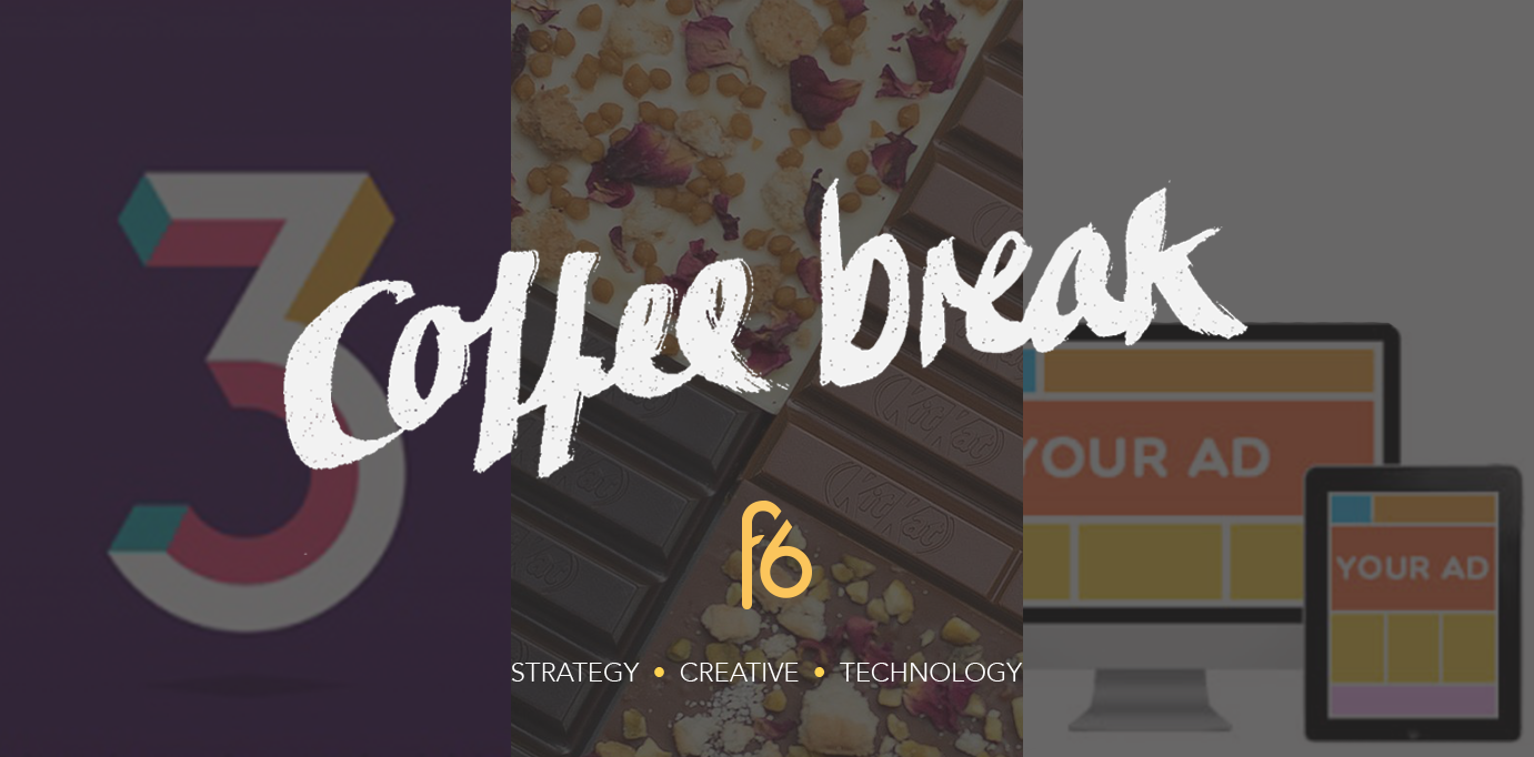
Grab a coffee and enjoy our round up of the week as we ask how to make online advertising worthwhile, how to make your own KitKat, and how to make a bank not look like a bank.
Candice, Managing Director
Gaze time, ad clutter, and personalisation: How to make online advertising worthwhile
Marketing is the lifeblood of every business. In this digital age, increasing sales as well as revenues are equivalent to being able to successfully use available marketing technologies. There are many ways to get your marketing message across. For example, don’t underestimate the value of online display advertising – this allows you to sell your product or service through visually appealing text as well as graphics, animation, and video.
I started thinking what would the average dwell time need to be in order to make online advertising worthwhile. The more I researched the more I realised that it is not just about dwell time, but various other factors that drive the best results.
According to a new study on the relationship between viewability, gaze time, ad clutter, and a person’s ability to remember ads, an online ad needs to be on screen for 14 seconds to have any chance of being looked at. That is a fairly long time to keep people’s imagination, and so making sure you have a strategy to deliver these ads is important.
Strategic placement of online ads is critical. Placing them on sites that are already promoting your target market can make the ads relevant, personalised, and timely. All these help in creating a successful advertising campaign or increasing the chance of your ads getting noticed, clicked, and bought by your target audience.
Elena, Account Executive
Take a break, make a KitKat
Calling all chocoholics! KitKat has just launched a pop-up chocolate factory in London! The ‘Chocolatory’ has been created by famous chef Michael O’Hare, and allows visitors to create their own personalised KitKat bars, choosing a chocolate coating, three toppings, and a tailored box design.
The brand aims to connect with 18-35-year-olds through the personalisation of the product. It’s a great strategy that brands are tapping into more and more.
Watch The Drum’s video covering the event here.
Sian, Creative Artworker
When banks don’t look like banks anymore
What does a bank’s brand look like? What should a bank’s brand look like? Banks, much like supermarkets, are struggling with public trust issues, and so stepping outside of how we expect banks to behave, and therefore how we expect them to communicate visually with us, is brave.
This week Natwest has inched itself forward over that line of expectation to become one of the first high street banks to put a stop to the soul destroying fashion of advertising that uses aspirational lifestyle photography (no one looks that happy and full of energy moving house). Hoping to stand out from it’s competitors, the brand refresh sees a three dimensional, animated logo that pays homage to its 1968 roots, alongside a collection of brightly coloured brand assets.
Points of differentiation are important in brand building in that they aid in crafting a conceptually solid and distinctive visual language that can help a brand stand out in cluttered and commoditised sectors. However, would I work with a lawyer who handed me a business card typeset in Comic Sans? No. Crossing visual meanings and semiotics can be tricky, and instead, it’s all about balancing being forward thinking, with widely accepted expectations. Where that line of expectations lays and how far it can be pushed successfully and so swiftly (things do change over time) will depend on a lot of factors. But for the banking industry there are certain ways we expect a bank to act, making the line pretty well drawn in an industry that relies on trust and in which the public is still very much out of love with.
First Direct is a great example of a bank that’s managed to differentiate itself, tip toeing over that boundary of expectations to redefine what a bank could look and speak like, whilst not terrifying everyone in the process. This visual differentiation was based in a firm concept of them being straightforward and honest – everything is black and white, in more ways than one. It worked because its simple, and banks weren’t simple. And in a time where no one trusts banks, we want black and white honesty.
Natwest, however, has gone one step further, by trying to be everyone’s best friend, especially *holds breath* millennials, with their bright colour palette and playful three dimensional typeface. When the rest of high street banks are all playing it safe by trying to be relatable with their full breed lifestyle photography and overlaid sans serif typography, it’s certainly a commendable and eye catching approach, that will do nothing if not differentiate them. The craft is great, the colour palette works well, and the animation and motion direction are delightful.


