0%
more new business
0%
net promoter score increase
0
new sales leads
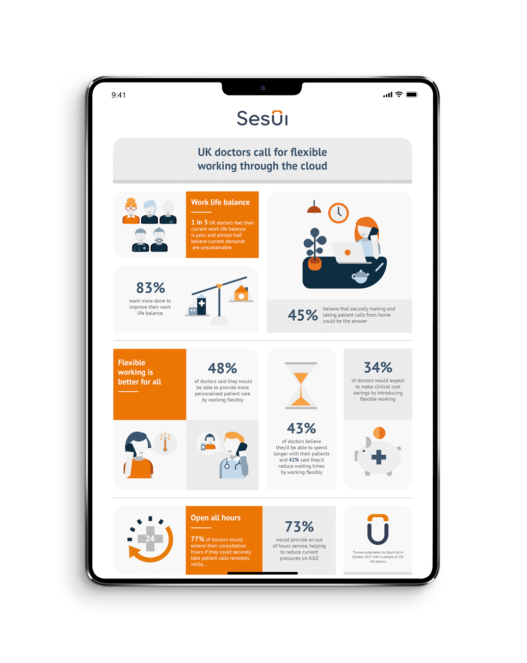
Sesui is the bright British innovator of award-winning cloud communications software. For 15 years they’ve specialised in untangling communication systems and putting them into the cloud for organisations that provide a vital service in healthcare, travel, manufacturing, and the voluntary sector.
Sesui’s team was at its biggest yet; which is why they needed brand clarity more than ever. A colour palette and logo weren’t making the cut anymore—the team needed an authentic cause to get behind, along with versatile visuals and a tone of voice that reflect it. They were missing chances to make a lasting impression on their target audience.
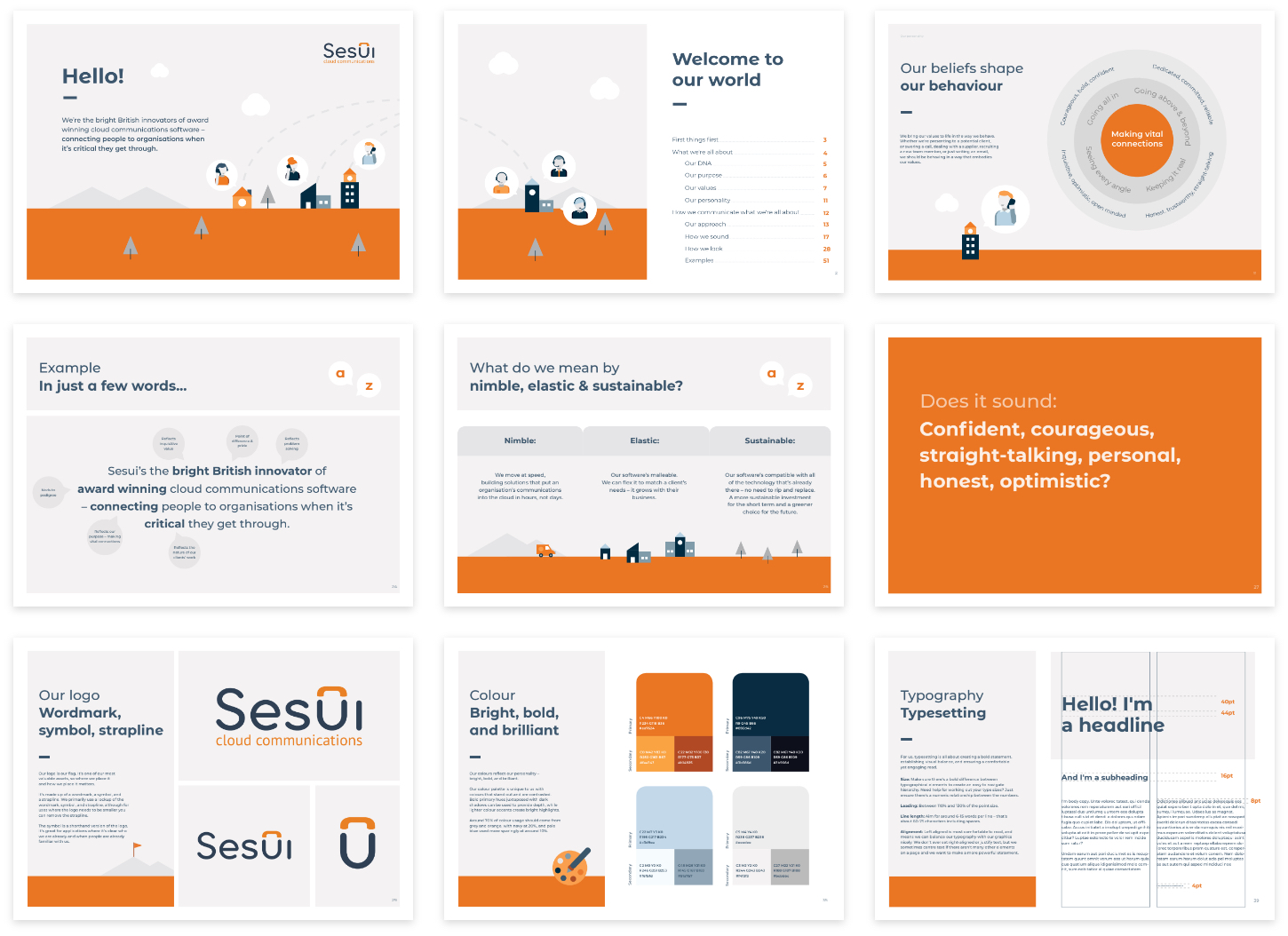
We ran workshops with Sesui to find their purpose and values; then built a creative strategy that would direct their new identity and marketing communications.
Though the Sesui team was diverse, there was one thing they all had in common: a love of puzzles. From weekly quizzes to sudoku, each team member had a serious passion for brain-teasers of all kinds.
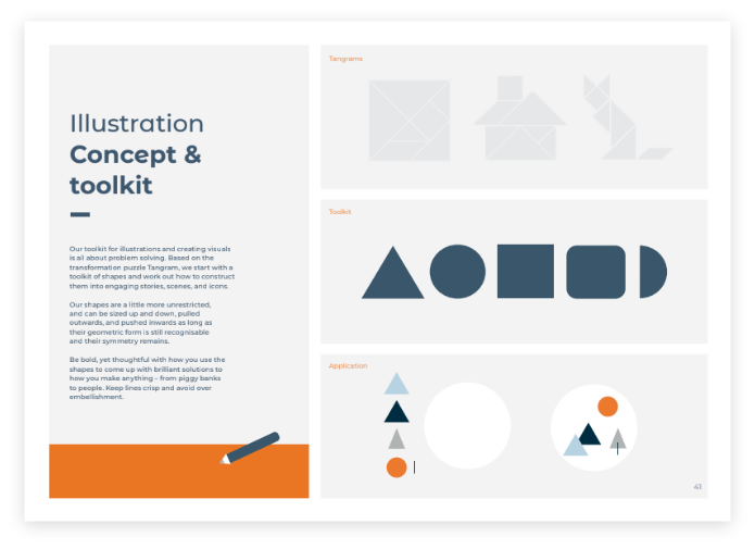
An identity based on solving puzzles
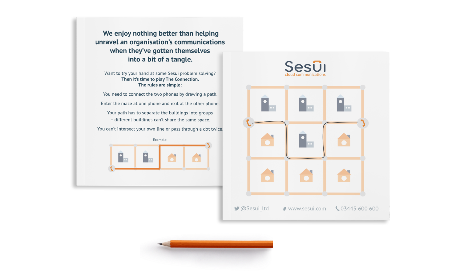
Puzzles feature in marketing materials to explain Sesui’s solutions
Our eureka moment came when we realised this was the groundwork for a new creative strategy. If problem solving was important to them as a team, and central to what they do as a business, it should also be the guiding principle for how they communicate—from visuals to marketing activities.
We also discovered that ‘Sesui’ is an anagram of ‘issue’, which allowed us to build a puzzle-centric narrative around their name. And we used tangrams—an ancient shape-based puzzle—as a basis for their visual language.
Now, whenever a Sesui designer begins a project, they’ve got a puzzle to solve; and we’ve given them the toolkit to do it.
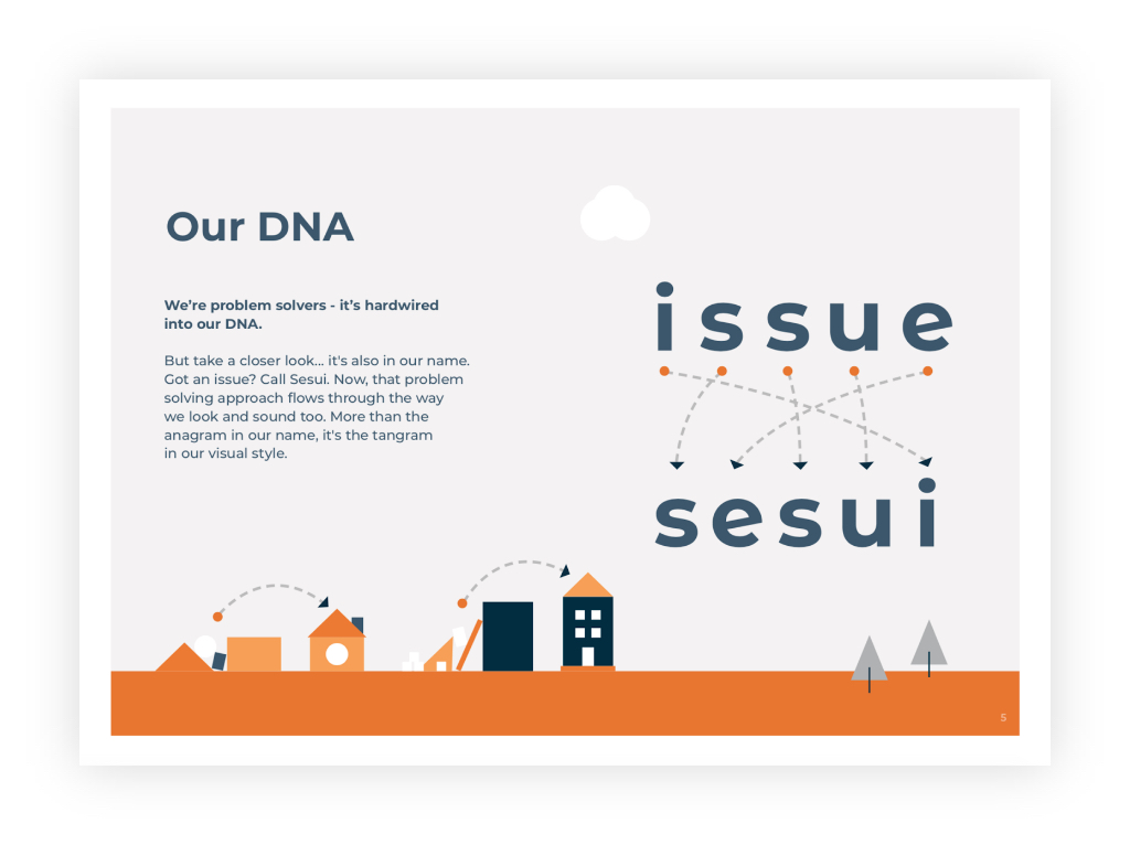
Giving the name a new story
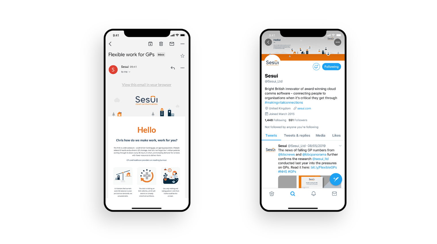
With a powerful set of values now unifying their employees, and a set of guidelines showing how to execute those values, we gave Sesui a new identity and the tools to keep their communications clear, consistent, and engaging.
The F6 team created a reinvigorated look and feel that truly reflects who we are as a company, and will ensure brand consistency for us going forward. Furthermore, they provided strategic support to drive lead generation with targeted campaigns across both print and digital.
We highly recommend the F6 Agency; they have exceptional design skills and go above and beyond to add value.
Head of Marketing & Strategy, Sesui