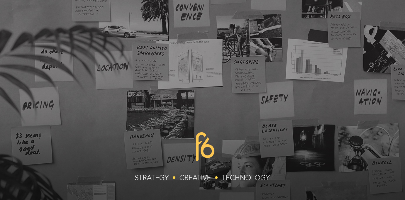
It’s a Thursday morning and I’m scrolling through my Twitter feed. There’s been a scandal. People are outraged. Except it isn’t really a scandal: It’s the announcement of Instagram’s new logo the day before, and now I’m watching a tidal wave of angry spectators flooding social media with their opinions.
I flick to Facebook and go to Instagram’s page. 2.5K angry reactions. 296 people were in tears.
“Biggest design fail of the year. Hope you guys are realising you screwed up everything that made Instagram what it is today.”
“A child could have made this with crayons in 10 minutes.”
“It literally looks like it was slapped together on PowerPoint or something.”
“Photoshop gradients huh? Give everyone in that design department a pat on the back from me.”
And then there were the memes:
![]()
It took me a while to find a comment that spoke of the new logo in any sort of positive light:
“Simplified logo which really pops alongside my other colourful app logos. A cool change that sits with today’s design trends. But hey I don’t know design like all these other people, clearly 💅”
And it’s perhaps that sassy sentence and even sassier emoji at the end of this comment which touches on a lot of my frustration.
Of course not everyone went to design school. Nor do they have an immediate interest in design and how and why it works. But a lot of the opinions aren’t based on anything other than ‘I don’t like it’.
Why design is becoming a brutal spectator sport of social media users hollering at the those with years of education and experience is a topic to be covered in itself, but James Greenfield has summed it up more eloquently than I ever could, is his article ‘Remarkably Touchy Lot, Designers‘:
“(It’s) the thinking that graphic design is perceived to be easy. It’s colouring-in and a few shapes, slapping new logos on old brands, something anyone could do with the right software and some time… Misperception is easy in our industry, which, ironically, is branding’s beauty – its simplicity, when it’s good, is also its key attack point. It’s why so many people miss the semiotic triggers which make them buy goods, engage with messages and watch content globally every day.”
So is there any other reason not to like it apart from a dislike of change, and an emotional attachment to the previous logo? Is this a good logo, or is the majority on social media right?
Let’s start in the beginning. The Instagram app was released in 2010. Since then we’ve had some pretty radical design leaps: Google’s Material Design in 2014, and of course Apple’s iOS 7 in 2013. Both of these signalled an overhaul in interface design, focusing on simplifying the complex whilst challenging the scope of our understanding of interfaces through use of 2.5D. Most notably, both updates favoured a flat approach to Graphic Design, and ditched any skeuomorphic elements.
In 2016, Instagram’s logo still used a skeuomorphic approach, which amongst these progressions in design, was beginning to look dated.
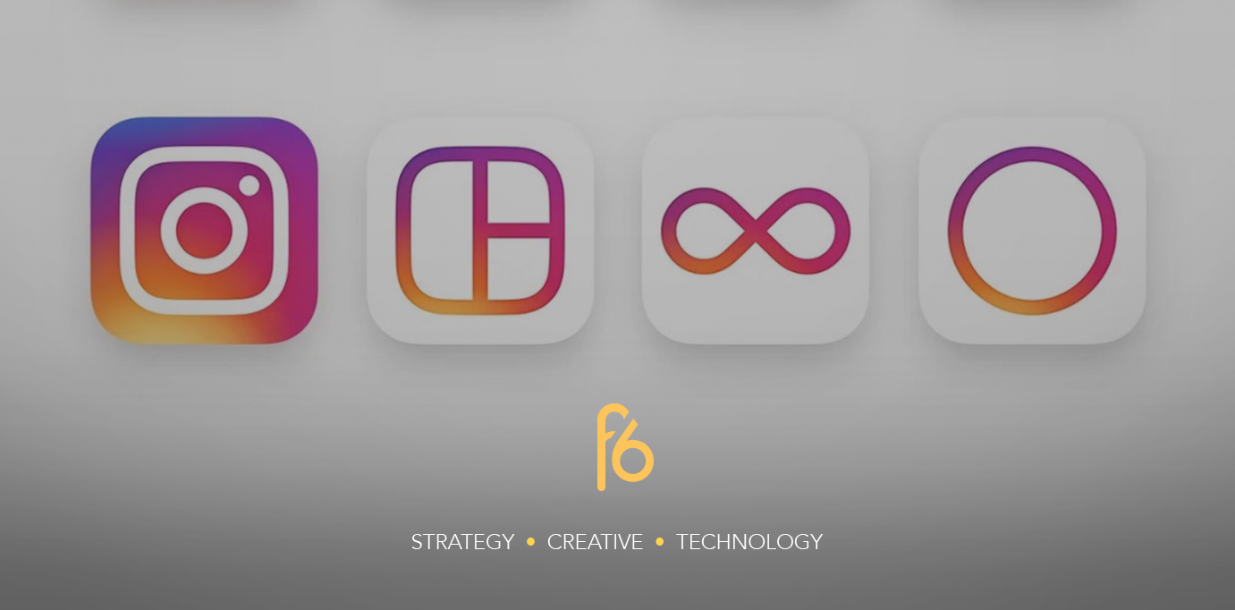
Furthermore, Instagram itself has changed. Today we’re able to upload pictures and videos of any size, unrestricted by the polaroid square format the old logo alluded to. Several ‘child’ apps have also sprung up on the app store, acting as subsidiaries of the app that allow you to create photos and videos in different ways to then be uploaded via the Instagram app. In this case, when comparing these app logos to the original Instagram logo, the brand looked like it was struggling to do what a lot of good brand identities can do: migrate.
But at the same time the logo had become iconic and synonymous with social photo sharing. People attached meaning to the original logo, heightening its value, and meaning any change was likely to be an unwanted dismantling of these meanings. So how do you refresh a brand and logo that people are attached to, but is quickly being left behind in terms of design progress?
Instagram’s answer was to look for the icon in the logo and work on an almost neuroscientific level.
There’s a fascinating overview video of all the iterations of the new logo. It shows that, unlike the comment suggesting a child could make it in 10 minutes, the new logo was heavily deconstructed and reconstructed numerous times before landing on the final version. No PowerPoint or Photoshop default gradients. Instead a carefully considered, hands-on, experimental process.
https://www.youtube.com/watch?v=fd07zrfn2Wc
Ian Spalter, head of design at Instagram, started by asking every employee to draw the logo from memory in under ten seconds. An inspired idea as this would help the design team work with the principle of reductionism, throwing away everything that is useless and leaving only the thing that people resonated with – the icon.
Most people drew the lens, the rounded corners and the viewfinder in the top corner.
Darren Bridger has written a short but informative article on the Neuro Design thinking behind this reductionism and argues that by recreating these elements in a simple way, the logo appeals much more to our subconscious minds: ‘Designs that are simple on the surface appeal to our brains as they feel familiar (something we like).’
Elements of the rainbow can be seen in brightly coloured gradient. This teamed with the white outline gives a high colour contrast, making the app icon pop out amongst others as we flick through our phone screens. Ever unconsciously picked up your phone, swiped through your apps and selected one before you even knew what you were doing? This is visual saliency at work.
A bonus of this simplicity and colour gradient is the ability to migrate. Instagram has successfully overhauled its child apps to look like offspring of the Instagram app. Through a few visual cues like reversing the gradient out of white, we get the idea that these apps are subsidiaries to the Instagram app. The apps now look like a collection with a hierarchy that can be added to in the future.

In identifying the icon from within the skeuomorphic logo, and employing a few neuroscientific design techniques, Instagram has bought its logo up to date, given its brand the tools needed to migrate, and ensured they’ve kept our attention.
But hey, I don’t know design like all these other people 💅.