2017 was the year where brands met political, social, and cultural unrest with visual languages that seeked calm, authenticity, and simplicity. Greenery, soft pinks, and mixed metals gave us that hygge-like, cosy, reassuring feeling that everything was going to be ok.
This year brand visuals are stepping out and becoming bolder. They’re growing up, taking ownership, and in some cases, presenting brave, vivid, and unexpected alternate realities to escape to.

Made.com, the 2017 leader in pastel pinks & greenery
Images – Artful and surreal
Getty suggests photographic images will borrow from history, taking on a ‘second renaissance’ that “reignites the idea of craftsmanship in an age where it’s never been easier to take a photograph.”
In a similar vein, art photography—that is photography that’s done as fine art—will be used to create flagship images that focus on composition and craftsmanship, but take on a surreal, expressive edge that uses incongruous imagery to present alternative visions of reality.

Aishti by the sea by Sagmeister & Walsh
Instead of the usual lifestyle imagery we’ve become accustomed to, products are likely to be presented in more unusual ways, with compositions, mixed mediums, and 3D sets that aim to convey the unexpected, and in some cases, the impossible.

R-L: (1) Nike AirMax, (2) Audi by Peter Tarka, (3) squarespace.com (2018)
Escapism from reality will also be present with techniques like gel photography set to coincide with colour trends, producing images with lush colour tones, rich shifts, and moody depths that are impossible to achieve in photoshop.

R-L: (1) Supersaturation Sadness by Local Preacher, (2 & 3) Neon Hoodies by Tim Tadder
Colour – Bold, moody, and ultra-neon-edged
Those surreal, alternate worlds are making their way into how we’re using colour. The Soft, calming hues of 2017 are out, and instead colour is expressive, intense, and contrasting, evoking those ideas of bold confidence, fantasy, and surrealism.
Pantone’s colour of the year sets up the theme of 2018 with a name that evokes a brave, vivid, confident presence. Ultra-violet is a blue-toned purple that draws on the idea of the new and unknown—an “exploration of new technologies, the galaxy, artistic expression and spiritual reflection”.
Gradients—a staple in the design community for a few years now—are also getting a vibrant upgrade, throwing out the duo tones of previous years and instead aiming for depthy and moody neon edged colour compositions that ooze contrasting, unusual combinations of tonal brights. A far cry from those nature-based greens and calming pastels.
Brands that are already jumping on the bright hued bandwagon include YouTube and Spotify, who’ve both upped the saturation of their leading logo colour, with YouTube hitting an eye sweltering max of 255 on the red of the RGB scale.

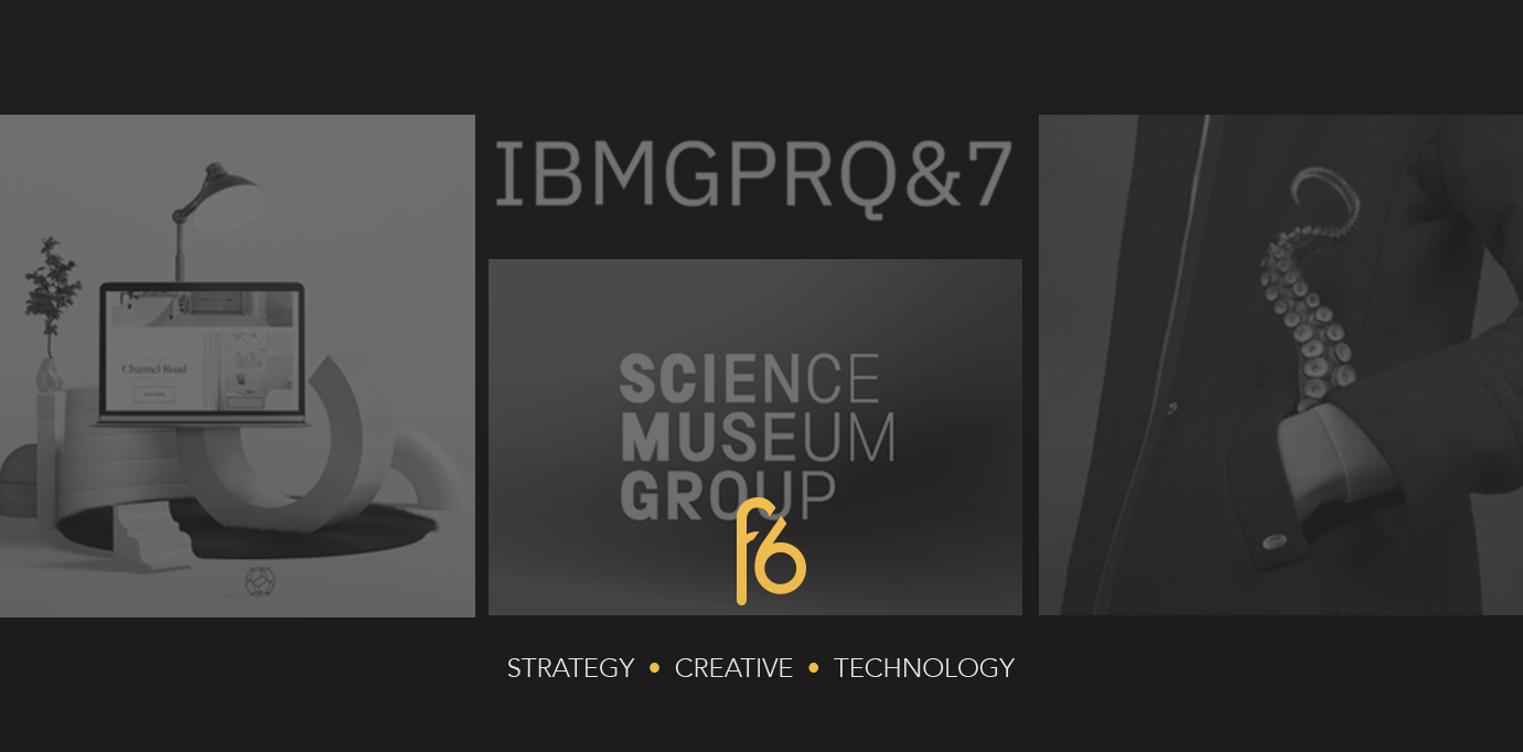
L-R: (1) Science Museum Group rebrand, (2) Apple iPhone X backgrounds, (3) Pantone Colour of the Year 2018
Typography – ownable and bespoke
This year it’s all about brands really taking ownership of their identities in all senses, and typography is the new frontier. Brands have already started creating bespoke typefaces with details that upgrade the usual utilitarian fonts with accents that mirror staples in their visual languages.

(Left) Coca-Cola typeface TCCC Unity, (top right) IBM typeface IBM Plex, (bottom right) YouTube typeface YouTube Sans
Logos – Growing up with an Occam’s facelift
Logos—often considered the faces of the company—are having the Occam’s razor treatment, stripping off all those unnecessary flourishes in an attempt to grow-up. Both Moonpig and Kickstarter followed the likes of Subway and Mastercard with their facelifts in late 2017, simplifying their marks with effortless lines, unfussy vector shapes, and clean colour palettes.

L-R: (1) Kickstarter rebranding, (2) Moonpig rebranding, (3) Subway rebranding, (4) Mastercard rebranding
Digital – Depth and delightful details
Digital visuals in 2018 are all about thinking beyond the flat plains of the screen.
The idea isn’t new—Google’s material design was first to really look at the impact of interaction and touch on digital interfaces—but this year, flat design is likely to be bolstered by a bigger investment in depth and shadow, created by the addition of dark and light shifts in colour tones.
Furthermore, 2018 will be the year of delightful details in web design. With an increase in platforms that produce out-of-the-box templates, brands need methods of differentiation. And they’ll do just that by investing a lot more in bespoke, micro details and interactions. How does the website load? What happens on-screen when I scroll, or hover over something? What’s the most delightful way to give a user feedback on their interaction?

L-R: Paste homepage 2018, Google Material Design